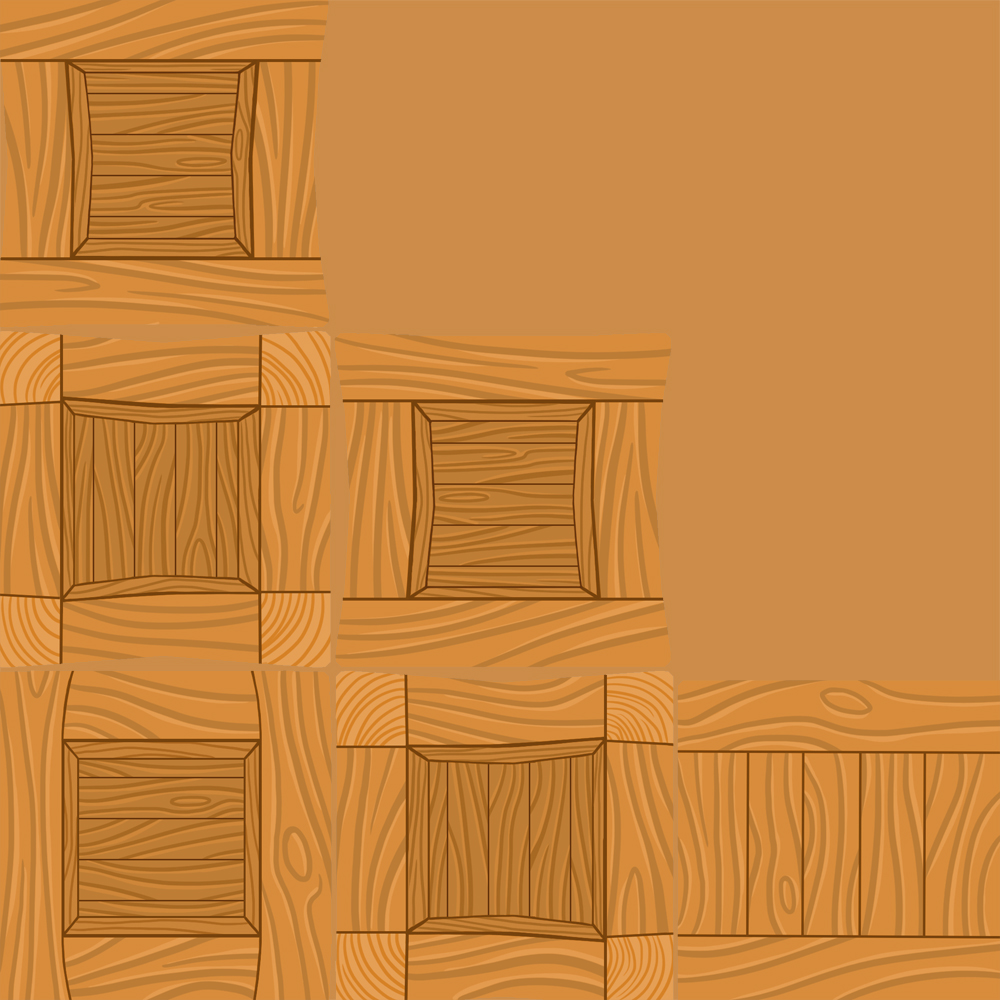
Hello again. Long-time no see. I’ve been stupidly busy lately and haven’t gotten around to posting any blogs, but I’ll hopefully be posting a couple of blogs this week to catch up on what I’ve been doing. As you might remember we optimized some 3D-crates that we’d made during class a couple of weeks back. For “Assignment 1”, we were to choose one of our crates and texturize it. I chose to go with my cartoony crate out of the three that I created.

Seen in the image above is my crate viewed in UDK (Unreal Development Kit), with the diffuse map (the image containing all of the different colours on the object) on. I chose to go with the cartoony styled crate as I wanted to create something simple, as I’m taking a long time to learn and understand all of the programs and parts of creating finished 3D-objects. However, I quickly realized that the cartoony style wouldn’t be as easy as I’d first thought as it would demand more time with painting the textures from scratch, as compared to using finished photos for textures, as I know that a lot of the other students did. I still wanted to try it out though, and stuck with the cartoony crate.


I chose to go with a yellow, yellow-brown happier colour, as it’s quite usual to use on wooden objects in cartoony games. I used a less saturated colour to begin with when painting the texture, but when I’d finished the diffuse map and had tested it a couple of times, it felt dull and boring, so I decided to make the colours a bit more colourful to make it feel less dull and happier. Generally, cartoony games such as for example The Legend of Zelda; The Wind Waker and Banjo Kazooie tend to have brighter and stronger colours, so an object with less saturated colours would risk feeling misplaced.
The main colour is a warm, wooden yellow. I wanted it to look friendly and inviting, whilst still feeling a bit natural and not too plastic with too strong yellows. A too strong yellow colour would have made it look too flat, and not even in cartoony styles are solid yellows often used for wooden objects. This colour feels more natural on a wooden crate, and shows that it isn’t anything dangerous. I wanted the colours to make the player think of it as wood, without standing out too much. I want the players to quickly be able to recognize it as a crate, and as something that isn’t dangerous, so that the players will find interest in the crates, perhaps smashing them for coins or health points.
I had a little trouble trying to take up as much space as possible with my uv, so that there wouldn’t be a lot of empty space around the texture, creating un-used pixels that just take up space instead of being used for something. This could have been solved, if the crate was supposed to appear in an actual game, by having two or more objects with similar textures share the same texture-file, instead of creating many different images with a lot of empty space on them.
I’ll be posting another blog soon going through my finished version of this crate, containing specular and normal maps.
Cheers! /MPh
