Hello again. For a couple of weeks we’ve been working on Assignment 1, being the crates that we’ve modelled during this time. Modelling these crates we’ve learned about the software that we’re using, and begun practicing with creating things in 3D and texturing them, trying to get used to the medium. Some of the students in class have worked with 3D before, but I’m not one of them, and I’m still not entirely comfortable with using the different programs. But hey, practice makes perfect, and last week I finished my first assignment.

As mentioned in my last blogpost, when we were going to texture one of our crates I chose to go with the cartoony crate that I’d modelled in class. With this crate I went through the whole process from rough model to clean up and optimizing, UV-mapping and then texturing it using three different kinds of textures, called “maps”.

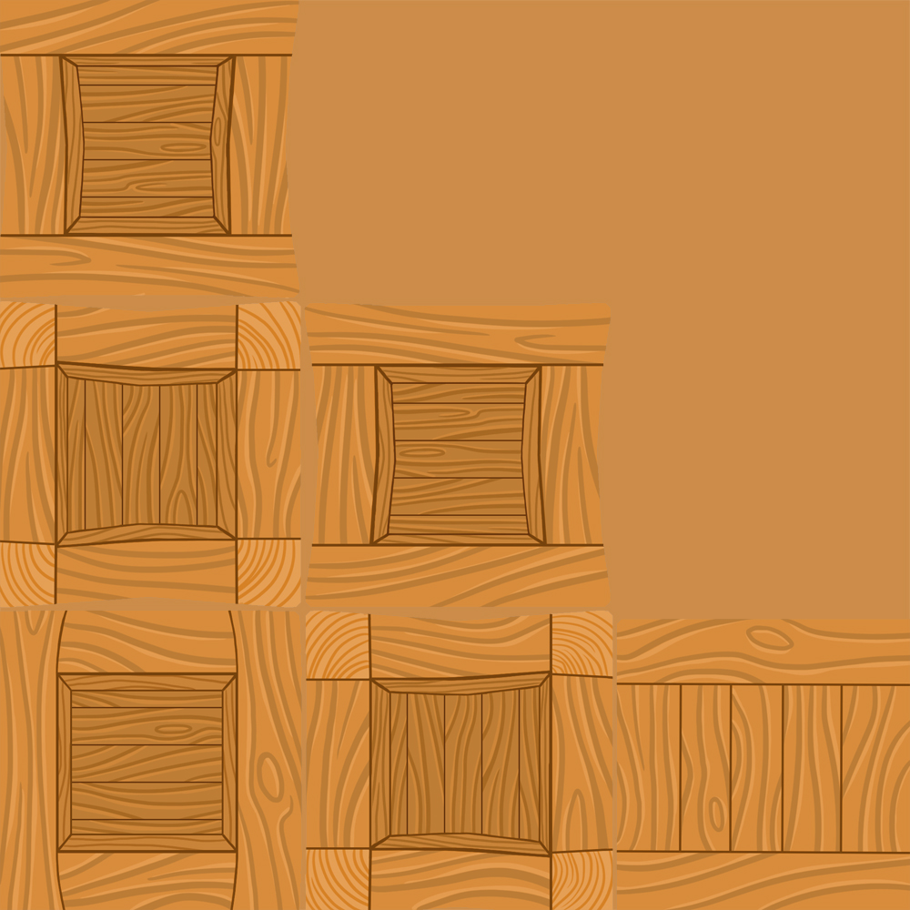
The first one, and the one that I think that most people think about when they hear the word “texture”, is the Diffuse map. The Diffuse map is basically the colour information of the texture, an unlit coloured texture. For example in my crate here it’s the colour of the wooden crate, showing the grain of the wood. When working on a diffuse map it’s important to remember not to shade it, as the model will be placed in an environment with an external light source that will create shadows on the model itself. If there are painted shadows in the texture, those might not alight with the direction of the light, or might not match the kind of lighting used in the environment. The only shading that might be added on a diffuse map is subtle self-shadowing, for example in corners or folds.

The second map is the Specular map, which determines the “shininess” of an object, or details in or on an object is. With the specular map we can determine what kind of material different objects or parts of objects are perceived as. For example metal is very shiny and will reflect a lot of light, whilst most cloth is more matte. This is very important, as we humans are very good at differentiating different materials from each other, even at a distance, depending on how shiny they are. It’s easy to tell if an object is shiny or not even from a distance, and if for example an object that should be matte is very shiny we’ll immediately see that there’s something wrong with it.
When creating the specular map, you use a greyscale image to determine how shiny certain parts are. Pure white will be super-shiny, whilst pure black won’t be shiny at all. Creating the specular map is usually a rather straight forward task, if one knows how shiny or matte the material is supposed to be. The closer to white that an area is, the shinier it will become, and the closer it is to black, the more matte it will be. In order to make sure that the specular map looks just like what you want you should make sure to test it many times before exporting the final product. It’s very easy to make it too shiny or too matte.

The third kind of map that we used for this assignment was a Normal map, which is used to create the illusion of unevenness on an otherwise flat surface. It can be used to create the illusion of depth or extruding edges, an uneven surface, without needing to model the bumps. These illusions though are just that, illusions, and they won’t break the silhouette of the model, and should thus only be used on smaller details that aren’t supposed to break the silhouette, like for example small indentations in the grain of a wood-plank, or the slight extrusion of a nail. If the shape is supposed to break the silhouette it should be modelled onto the model itself instead of being created with a normal map.
There are a couple of different methods to creating normal maps, but for this assignment we created a greyscale image, much like the one for the specular map, but where white created the illusion of something extruding from the model instead of shininess, whilst darker greys closer to black created the illusion of depth. Using a free trial of the program Crazybumb, we converted the greyscale image to a different normal map that uses RGB to determine the shapes, where each colour (red, green and blue) represents a different direction.
Below are two images showing my normal map in Crazybump. Notice the parts that seem to extrude from the texture when facing the camera, and then look at the second image, showing how the illusion breaks when looking at the model from the side instead, as the normal map doesn’t actually break the silhouette. It’s just an illusion.


A couple of weeks ago I had never opened a 3D-program, and I hardly knew anything about modelling in 3D or texturing. Learning these programs and how things work is a very hard and time consuming process for me, and I’m still having a little trouble with keeping up as it takes such a long time for me to understand what I’m doing and then managing to actually do it. Still, I’m proud of what I’ve managed to create even though this is a very simple model. It’s far more detailed than what I thought that I’d be creating during my first weeks learning 3D. Even though I find it hard, I’ve learnt a lot, and for that, I’m proud.
Cheers!
/MPh